
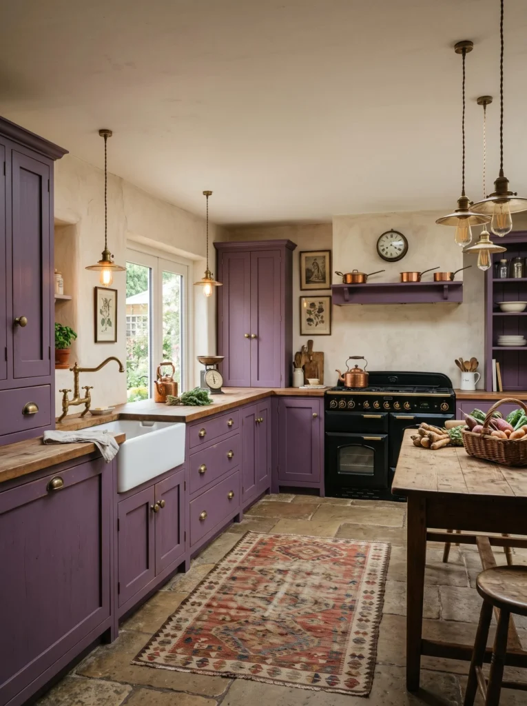
If you’ve been dreaming about a kitchen that actually has some personality, I think you’re going to love this one. The bold purple kitchen cabinets with cream walls contrast look is one of my favorite color combos to work with because it’s dramatic without feeling cold or overdone. Purple brings in that deep, moody richness, while cream keeps everything soft and airy so the room never feels too heavy. Honestly, it’s the kind of kitchen that photographs beautifully but also feels like home every single day. Let’s walk through twenty different ways to bring this look to life in your own space.
A Rich Purple Base That Anchors the Whole Kitchen
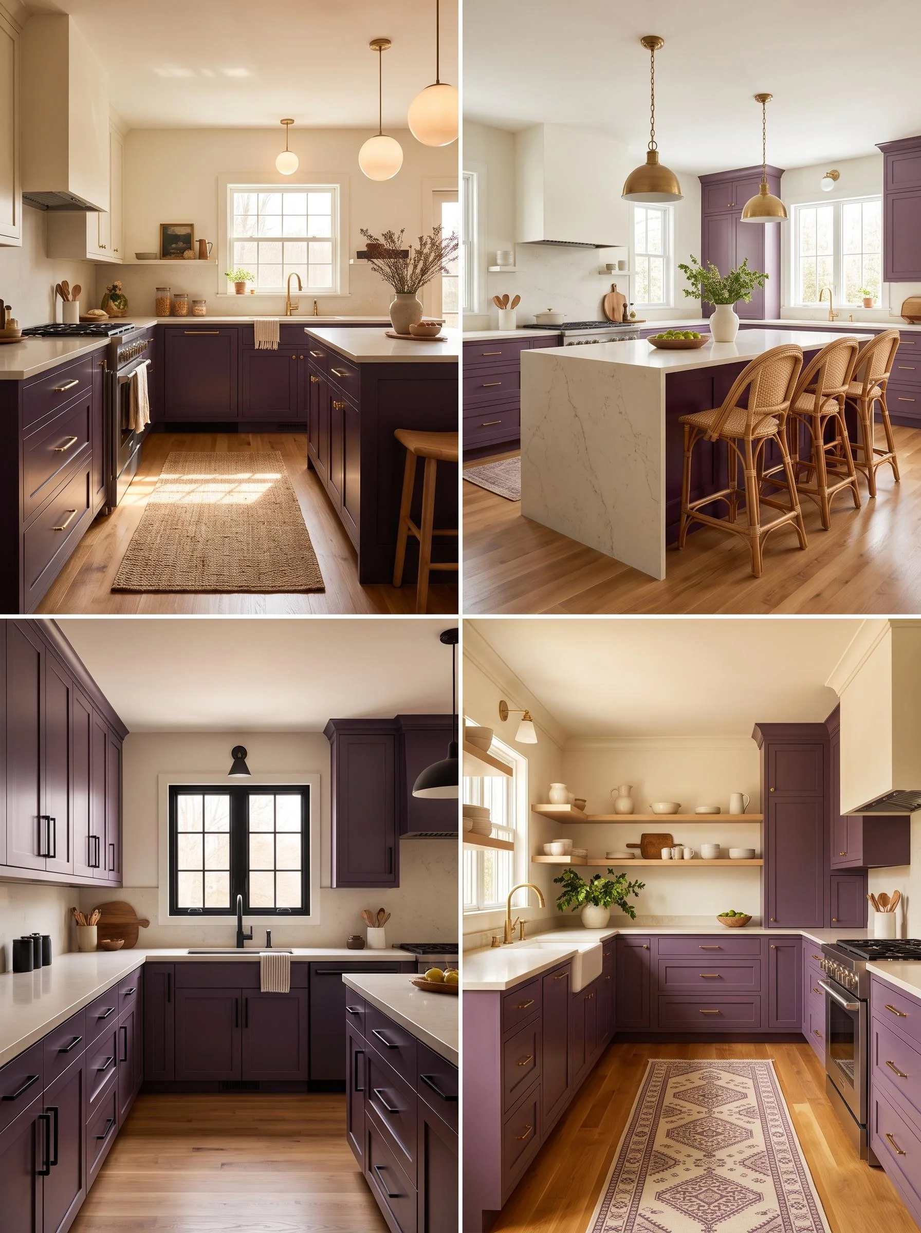
Start with a deep eggplant or plum purple on your lower cabinets, and let it be the star of the room. This shade works so well because it’s dark enough to feel luxurious but still warm, not cold like navy or black can sometimes read. Pair it with brushed brass or matte gold hardware to soften the intensity a little. For countertops, a creamy quartz with light veining keeps things balanced. Add a woven jute rug nearby for texture, and finish with warm dimmable lighting overhead. This combo works because purple grounds the space while cream keeps it light, and it’s easy to recreate with just a cabinet paint refresh.
Cream Walls That Soften and Brighten the Space
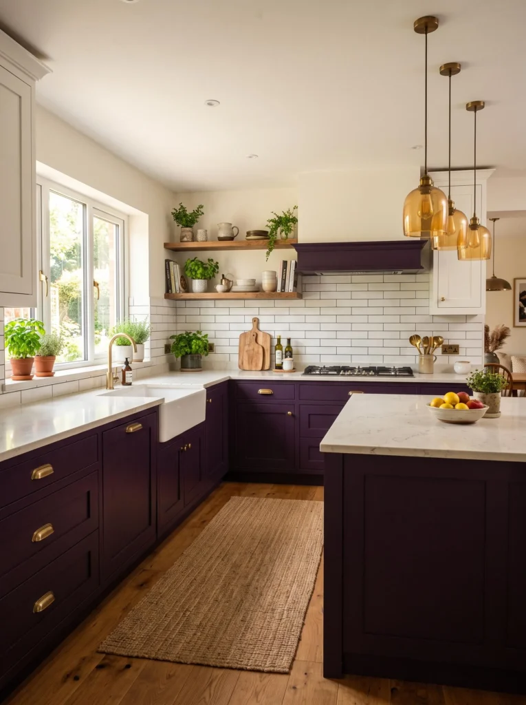
Cream walls are honestly the secret weapon here. They act like a gentle backdrop that lets the purple cabinets do all the talking without the room feeling too dark or closed in. Go for a warm cream, not stark white, since it adds coziness and pairs beautifully with wood tones. Add simple crown molding painted the same cream shade for a seamless, elegant finish. Bring in linen curtains or woven blinds for texture, and keep open shelving light with white ceramics. This pairing is one of the best ways to soften a bold cabinet color, and it’s an easy weekend paint project for most homeowners.
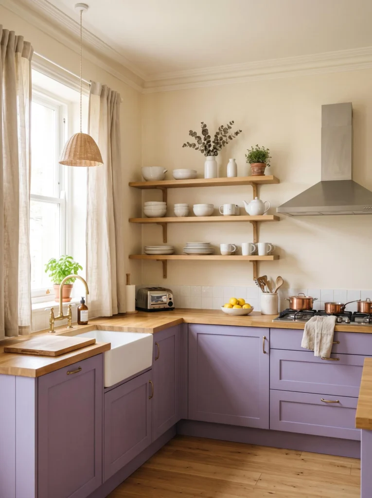
Brass Hardware for a Warm Metallic Contrast
Swapping in brass or antique gold hardware instantly elevates purple cabinetry. The warm metallic tone plays off the cream walls beautifully and adds a subtle glow throughout the kitchen. Choose slim bar pulls for a modern touch or ornate knobs if you’re leaning more traditional. Pair with brass faucet fixtures and pendant lights to keep the metal finish consistent throughout the room. A butcher block island adds warmth underneath all that shine. This idea works so well because metallics bridge the gap between a bold color and a neutral wall, creating a cohesive, polished look that feels intentional rather than accidental.
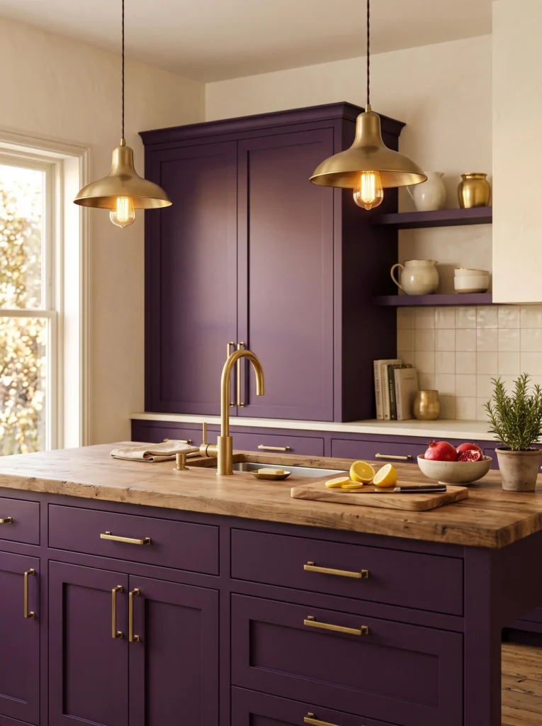
A Marble-Look Countertop for Timeless Elegance
Nothing balances a bold cabinet color quite like a marble or marble-look countertop. The soft grey and cream veining ties directly into your cream walls while adding a touch of classic elegance. Quartz is a practical choice since it mimics marble without the maintenance worries. Keep the backsplash simple, maybe a plain cream tile, so the countertop can shine as the real showstopper. Add a few brass canisters or a wooden cutting board for warmth. This look works because it softens the drama of purple cabinetry with something timeless, and it’s a combo that never really goes out of style.
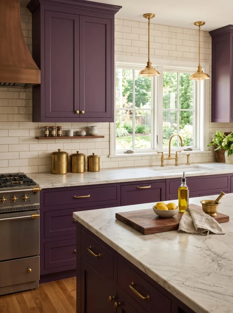
Open Shelving to Break Up Solid Cabinet Lines
Open shelving is such an easy way to add lightness to a kitchen full of bold color. Choose light wood or white-painted shelves and style them with cream dishware, small potted herbs, and a few woven baskets for texture. This breaks up long runs of purple cabinetry and gives your eyes somewhere to rest. Because the bold purple kitchen cabinets with cream walls contrast look already has a lot going on visually, open shelving keeps things from feeling too busy. Add small brass hooks underneath for mugs. It’s a budget-friendly update too, since you’re removing upper cabinet doors instead of buying new ones.
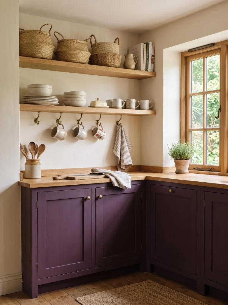
A Statement Island in Deeper Plum
If your main cabinets are a medium purple, try going a shade or two darker on the island for some depth. This creates a layered look that feels custom and designer-made. Add a waterfall countertop edge in cream quartz to tie the island back into the walls. Stools in a natural rattan or cream boucle fabric add softness underneath. Pendant lights in warm brass hang above to pull the whole space together. This idea works because contrasting cabinet shades within the same color family feels intentional and rich, and it gives your kitchen a sense of dimension that a single flat color can’t achieve.
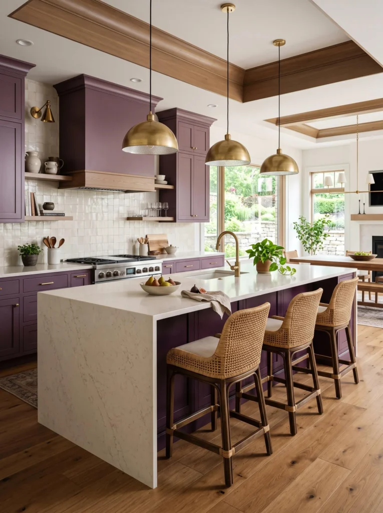
Warm Wood Flooring for Natural Balance
Wood flooring in a warm honey or walnut tone grounds a purple and cream kitchen beautifully. It keeps things feeling natural instead of overly polished, and it warms up the coolness that can sometimes come with darker cabinet colors. Wide-plank floors work best for a modern farmhouse feel, while herringbone patterns bring in a more traditional touch. Add a woven runner rug in cream and taupe tones for softness underfoot. Keep baseboards painted cream to match the walls seamlessly. This combination works because natural wood always plays well with both bold colors and soft neutrals, creating instant warmth in the room.
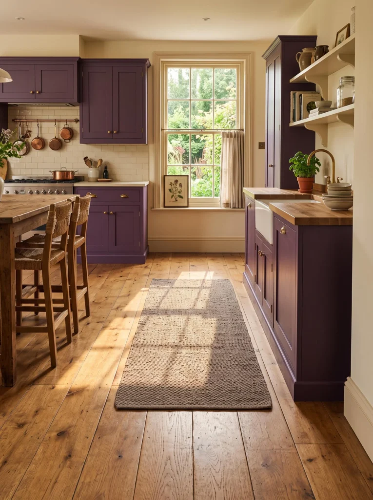
Pendant Lighting That Glows Over the Island
Lighting can completely transform how your cabinet colors read throughout the day. Choose warm-toned pendant lights, ideally in brass or amber glass, to hang over your island or sink area. These fixtures cast a golden glow that makes purple cabinets look even richer come evening. Cluster two or three pendants together for a modern statement, or space them evenly for a classic feel. Pair with under-cabinet lighting to highlight your backsplash. Soft, warm bulbs matter more than people realize, since cool white light can make purple look flat and cream walls look sterile. Good lighting really is everything here.

A Subway Tile Backsplash in Soft Ivory
A simple ivory or cream subway tile backsplash keeps the focus on your cabinets while still adding texture to the wall. Lay the tiles in a classic brick pattern for timeless appeal, or try a herringbone layout for something a little more elevated. Grout in a matching cream tone keeps the look seamless and clean. This backsplash choice pairs beautifully with brass faucets and open shelving nearby. It’s also budget-friendly and easy to install compared to bolder tile choices. The simplicity here matters because your cabinets are already the star, so the backsplash just needs to support that story quietly.
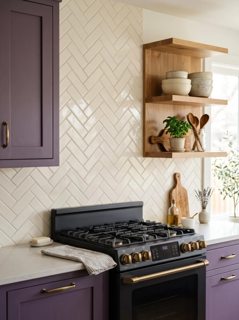
Glass-Front Cabinets to Display Favorite Dishes
Swap a few upper cabinet doors for glass fronts to add lightness and personality to your kitchen. Behind the glass, style cream and white dishware, glassware, or even a few purple accent pieces to tie the palette together. Add small LED strip lighting inside for a soft glow at night. This works especially well in kitchens where the bold purple kitchen cabinets with cream walls contrast look feels a little heavy, since glass fronts create visual breathing room. Keep the styling inside simple and uncluttered. It’s a great way to show off pretty dishware while softening the overall cabinet color throughout the space.

Matte Black Fixtures for Modern Edge
For a more modern, moody take, swap brass for matte black hardware and faucets instead. Black adds a sharp, graphic contrast against both the purple cabinets and cream walls, giving the kitchen a slightly edgier feel. Pair with black pendant lighting and a black-framed window above the sink for consistency. Keep countertops light, like a cream or soft grey quartz, to balance out the darker tones. Add a few brass accents sparingly, like drawer pulls on the island, to keep things from feeling too stark. This combo works well for anyone wanting a bold, slightly moodier version of the classic look.
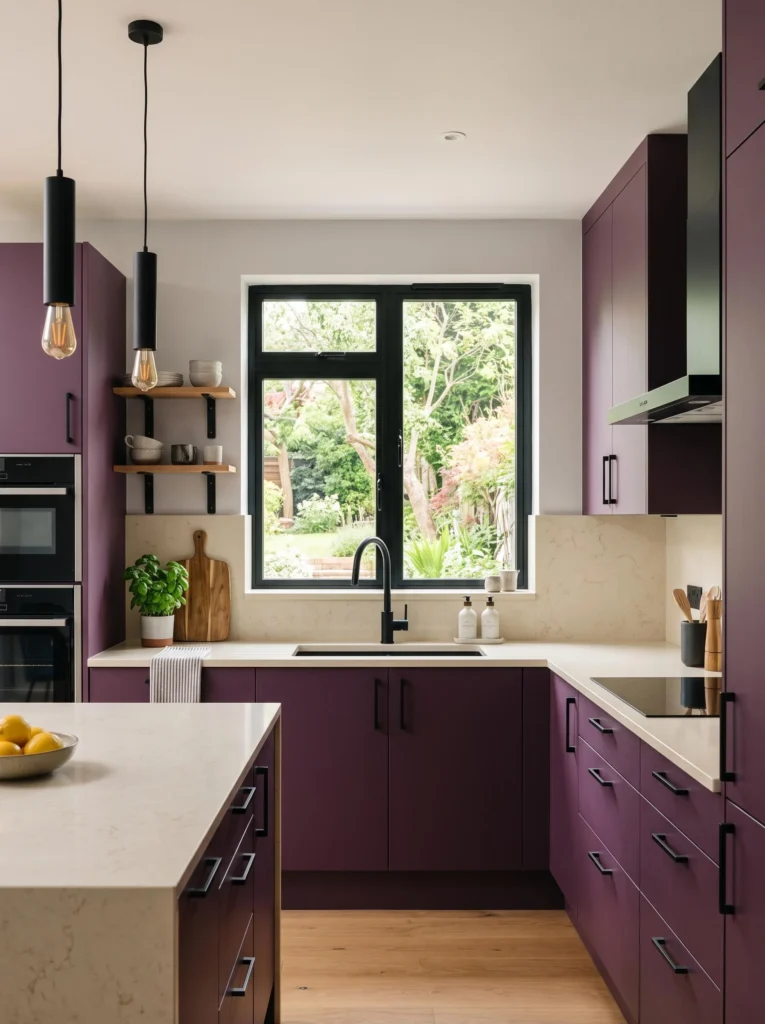
A Cozy Breakfast Nook Tucked in the Corner
Turn an empty corner into a cozy breakfast nook with a round wooden table and cream upholstered chairs. Add a small pendant light above and a woven basket nearby for extra storage. This nook softens the kitchen’s bold colors by introducing a more relaxed, lived-in feel. Layer in a linen table runner and a small vase of fresh flowers for warmth. Natural light from a nearby window makes the space feel even cozier. This idea works because not every corner needs to be about cabinetry, sometimes a soft seating nook is exactly what balances out a bold color scheme.
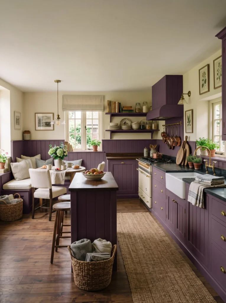
Layered Textures with Woven Baskets and Linen
Texture is what keeps a bold color kitchen from feeling flat or one-note. Bring in woven baskets for storage, linen tea towels draped over the oven handle, and a jute rug near the sink. These natural materials soften the smooth, glossy finish of painted cabinets. Add a wooden cutting board leaning against the backsplash for extra warmth. Cream ceramic canisters on the counter add both function and softness. This layering approach works because it gives the eye multiple textures to enjoy, not just color, and it makes the kitchen feel curated and collected rather than like it came from a single catalog page.
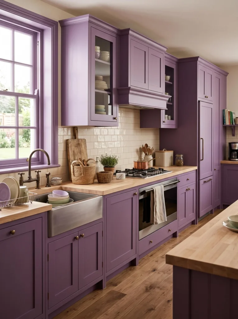
A Bold Range Hood as the Centerpiece
Instead of hiding your range hood, make it a design feature by wrapping it in the same purple as your cabinets or covering it in shiplap painted cream for contrast. A hood with a bit of shape, like a curved or tapered design, adds architectural interest above the stove. Flank it with open shelves or simple cabinetry on either side. Add brass trim along the edges for a polished finish. This idea works because the range hood is often the visual center of a kitchen anyway, so leaning into that instead of ignoring it creates a much more intentional, designer-style result.
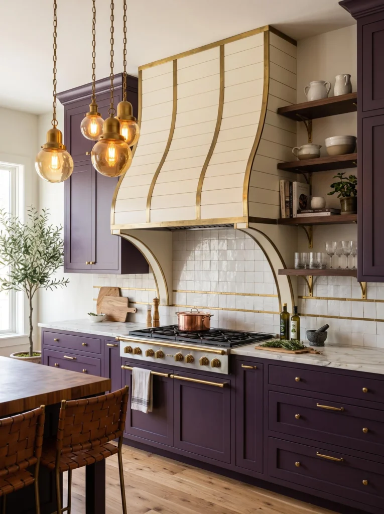
Soft Gold Accents Scattered Throughout
Small gold touches throughout the kitchen tie the whole look together without overwhelming the space. Think gold cabinet pulls, a gold-rimmed fruit bowl, or a slim gold-framed mirror near the sink. These little details catch the light and add a subtle shimmer against the matte purple cabinets. Keep the rest of the accessories simple in cream and white tones so the gold really pops. A gold faucet is another great way to layer this metallic in without it feeling like too much. This works because small doses of shine make a big difference in how polished and finished a kitchen feels overall.
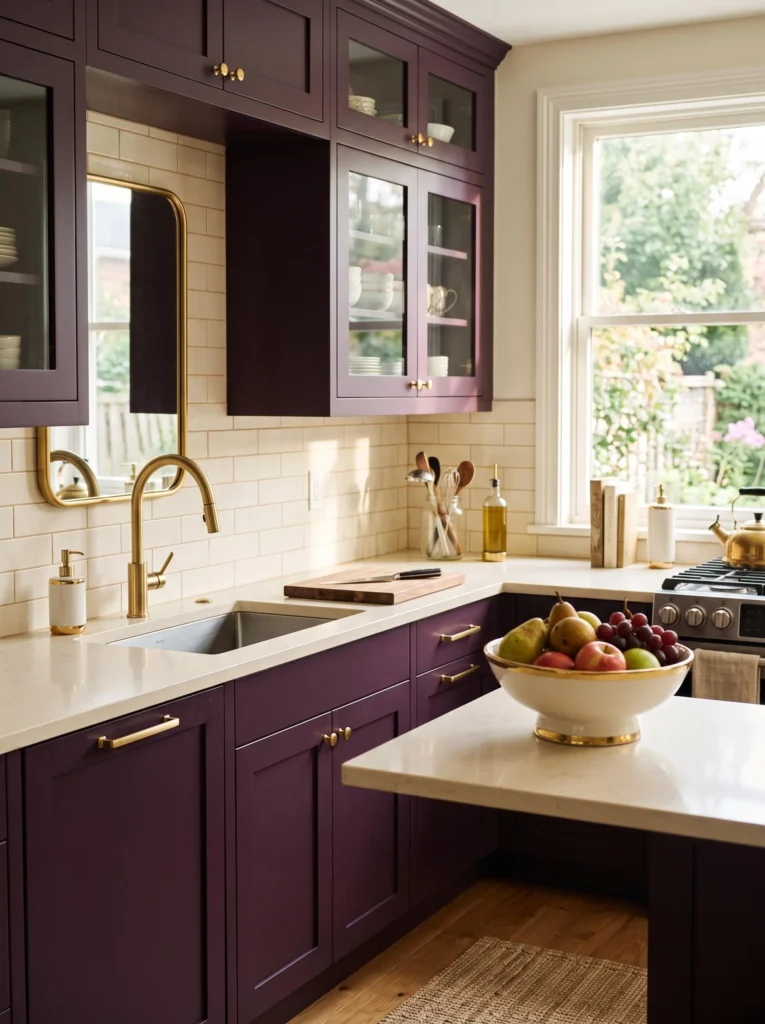
Greenery to Bring the Kitchen to Life
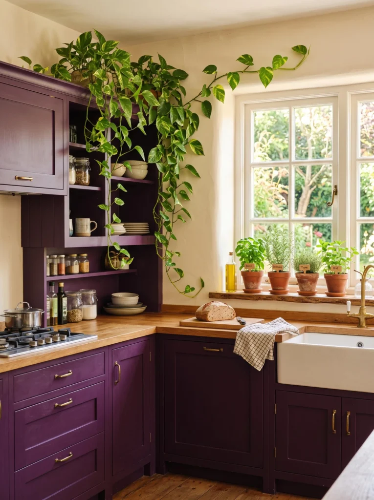
Adding real plants instantly softens a bold-colored kitchen and brings a sense of freshness to the room. A trailing pothos on top of the cabinets, a small herb garden on the windowsill, or a leafy fiddle leaf fig in the corner all work beautifully. Choose cream or terracotta pots to keep the color palette consistent. Greenery contrasts nicely against both purple and cream, adding a natural pop without clashing. It also just makes the kitchen feel more alive and lived-in. This idea works for renters and homeowners alike since it requires no permanent changes, just a trip to the local plant shop.
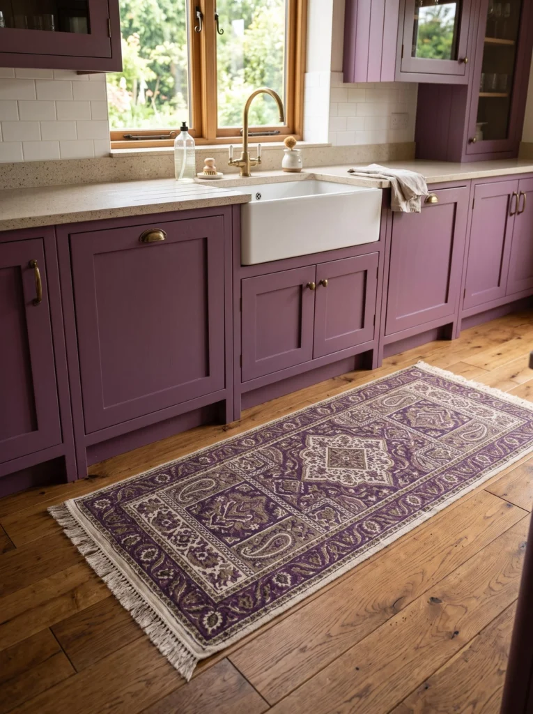
A Patterned Rug for Underfoot Warmth
A patterned runner rug in cream, purple, and soft taupe tones adds warmth and softness underfoot while tying the color scheme together beautifully. Look for a vintage-inspired or block-print pattern for a collected, curated feel. Place it in front of the sink or stove where you spend the most time standing. This small addition makes a big difference in how finished the kitchen feels, and it’s one of the easiest updates on this whole list. The bold purple kitchen cabinets with cream walls contrast look really comes together when the floor gets some attention too, not just the cabinets and walls.
Open Concept Flow Into the Dining Area
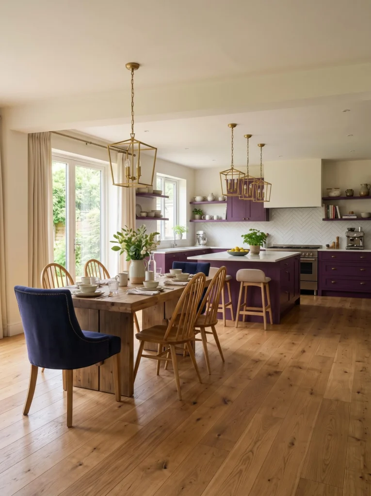
If your kitchen flows into a dining space, carry the cream walls and a few purple accents into that room too. A purple accent chair or cream linen curtains help the two spaces feel connected rather than disjointed. Keep the flooring consistent throughout for a seamless transition. Add a statement light fixture over the dining table that echoes the finish used in the kitchen, like matching brass or black. This idea works because open concept homes need color continuity to feel cohesive, and repeating just a few key elements is enough to tie everything together without redecorating the whole house.
Vintage-Inspired Cabinet Pulls for Character
Swap standard hardware for vintage-style cup pulls or fluted knobs to give your cabinets a little extra personality. These small details add character and make the kitchen feel more custom, like it was designed over time rather than all at once. Pair with a farmhouse sink and a bridge faucet for a cohesive vintage feel. Cream walls provide the perfect soft backdrop for these more ornate details to stand out. Add a vintage-inspired pendant light for good measure. This works because hardware is such an affordable update, yet it has a surprisingly big impact on the overall style of the room.
A Cohesive Color Story From Ceiling to Floor
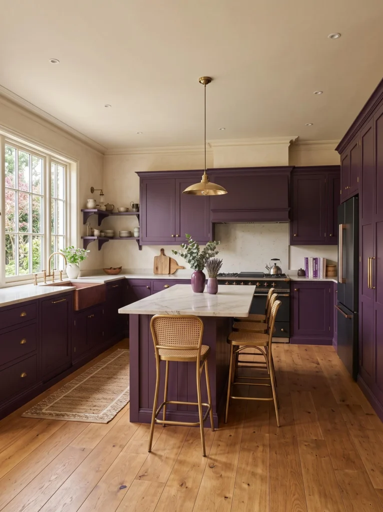
For the full effect, carry your color story all the way up to the ceiling with a soft cream paint, and all the way down to warm wood or cream tile flooring. This creates a cohesive, wraparound feel where nothing competes for attention. Add a few purple accents in the room, like a vase or a stack of cookbooks, to echo the cabinet color elsewhere. This top-to-bottom approach is honestly one of the most impactful ways to nail the bold purple kitchen cabinets with cream walls contrast look, since it makes the whole room feel like one thoughtful, intentional design rather than separate decisions.
Home Styling Tips
- Always test paint colors on your actual cabinets before committing, since lighting changes how purple reads throughout the day.
- Stick to warm metallics like brass or gold if you want the space to feel cozy rather than cold.
- Balance bold cabinet colors with plenty of natural materials like wood, rattan, and linen.
- Keep countertops and backsplashes lighter in tone so the cabinets remain the visual focus.
- Layer in greenery and textiles to keep a bold color scheme from feeling too flat or one-note.
- Use dimmable warm lighting to make deep purple tones feel rich instead of dark.
FAQs
Is a bold purple kitchen a good long-term design choice?
Yes, especially when it’s balanced with a soft neutral like cream. The bold purple kitchen cabinets with cream walls contrast look feels timeless because the cream keeps things light while the purple adds character. It’s bold but not trendy in a way that dates quickly, so it tends to age really well in most homes.
What wall color pairs best with purple cabinets?
Cream is one of the best choices since it softens the intensity of the purple without competing with it. Soft white or warm greige can also work, but cream tends to feel the coziest and most inviting alongside darker, richer cabinet tones.
What hardware finish works best with purple cabinetry?
Brass and gold tend to look the warmest and most flattering against purple, while matte black offers a more modern, graphic contrast. It really comes down to the overall style you’re going for in the space.
Will a purple kitchen make a small space feel smaller?
Not necessarily, as long as you balance it with light countertops, cream walls, and good lighting. Using purple only on lower cabinets while keeping uppers light or open can also help a smaller kitchen feel more spacious.
Conclusion
I really hope this gave you a ton of fresh ideas to work with in your own kitchen. There are so many ways to make the bold purple kitchen cabinets with cream walls contrast look feel personal, whether that’s through lighting, hardware, flooring, or just a few cozy textures scattered around. Pick one or two ideas to start with, and build from there as your style evolves. Go ahead and save this article or share it with a friend who’s planning a kitchen refresh, since this color combo really is worth trying at least once.